The self-exploration stage led him to choose empathy, practicality and innovation as values for his brand. They are the attributes that encapsulate his goal of creating straightforward and functional designs through innovative approaches.
Passionate, approachable, and adaptable adjectives best describe Tungdo’s brand personality. They demonstrate his love and excitement for craft and design, aim for accessible and impactful solutions, and receptibility to the audience’s needs and new ideas.
Challenge
This project’s challenge was to create a visual identity that expresses these values and personalities. Another requirement was to use graphics other than initials in the brand name. By doing this, the intended identity will have more freedom in expressing the attributes and reduce the personal ego, concentrating on the values it delivers to the audience.
Logo
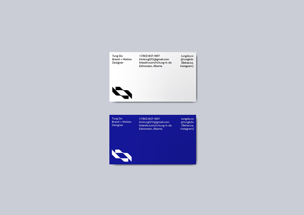
The logomark is a visual representation of two hands extending towards each other, capturing the empathy value of the brand strategy. The curved edges and fluid lines represent forward movement and the continuous pursuit of better creative solutions through innovation, curiosity, and experimentation.
Colour Palette
The primary colours of the brand identity are black and white, representing the practicality and clarity of the end products delivered to customers. Ultramarine evokes a sense of calm and humility. These values help define his approach, in which he lowers his personal taste and puts the audience at the centre of every decision. Pairing with Ultramarine, Pale Lime represents innovation, creativity, and a forward-thinking mindset.
Typography
The slightly quirky characteristics of the heavy-weight Syne font embody the daring to try different problem-solving approaches. In contrast, the DM sans font ensures the readability of the content and adds contrast to Syne’s strong personality.