Logo Review
The previous Animethon logo, implemented since 2006, lacks a thorough style guide and outdated visual assets. As the need for brand repositioning is identified, the existing appearance cannot express the event’s positive energy and falls behind competitors in a visually and emotionally based culture. The rigidity of the tori gate and dated typeface choices fail to convey the event’s vibrancy. Animethon needs a flexible style guide to create a consistent and professional look.
Logo Concept Development
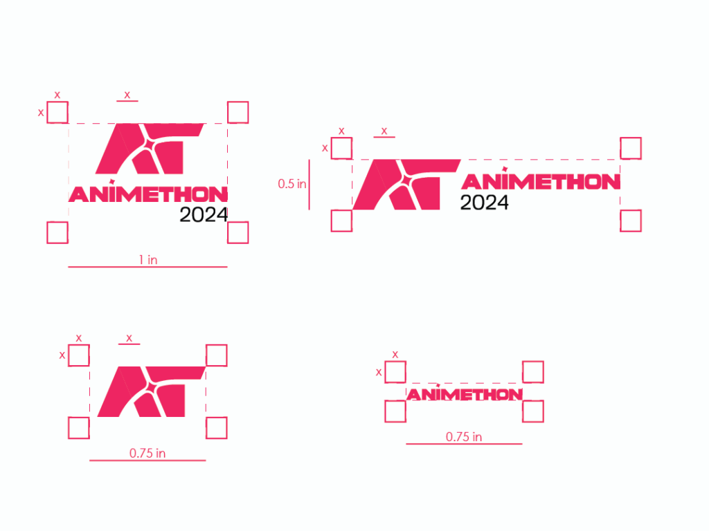
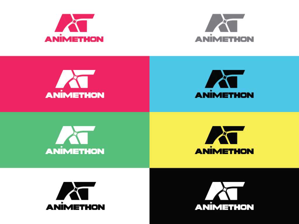
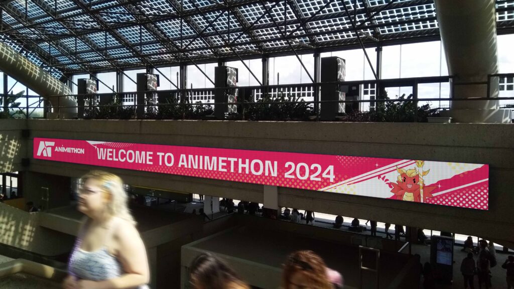
The new logo for an anime convention event retains the popular AT monogram and modernizes the font for a clean and vibrant look. The centre of the logo features a lighting star or spotlight, symbolizing positivity and renewal. The rising star imagery represents the brand’s commitment to constantly improving its services and fostering a community for Asian Pop Arts lovers. The logotype is balanced with the monogram, and the repetition of the star increases cohesion in the design.
Colour Palette
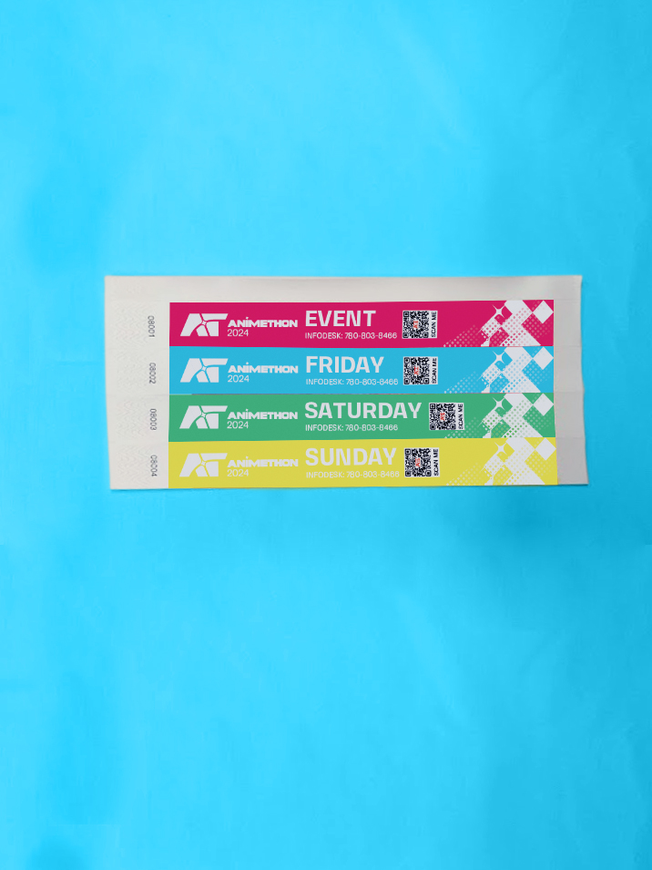
The four primary colours, red, cyan, yellow, and green, represent the event’s four mascots, with red being the primary colour and most widely used. The new palette conveys a futuristic and dynamic tone inspired by the Shounen Anime genre. Navy blue and purple serve as tertiary colours for added flexibility.
Typography
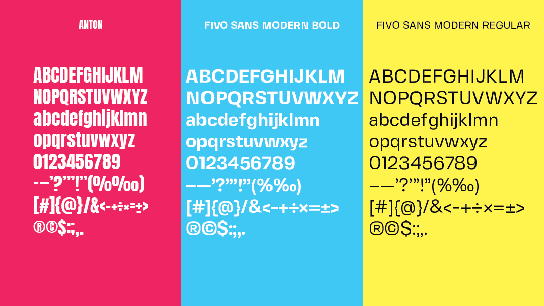
Fivo Sans Modern is the primary typeface with a high-tech look that complements the logo’s artistic style. Fivo Sans Modern regular is used for body copy, while its bold weight is used for headings to ensure consistency. Anton, a condensed sans serif, is added for flexibility in space-constrained circumstances or to emphasize specific words in tandem with Fivo Sans Modern.
Visualisation
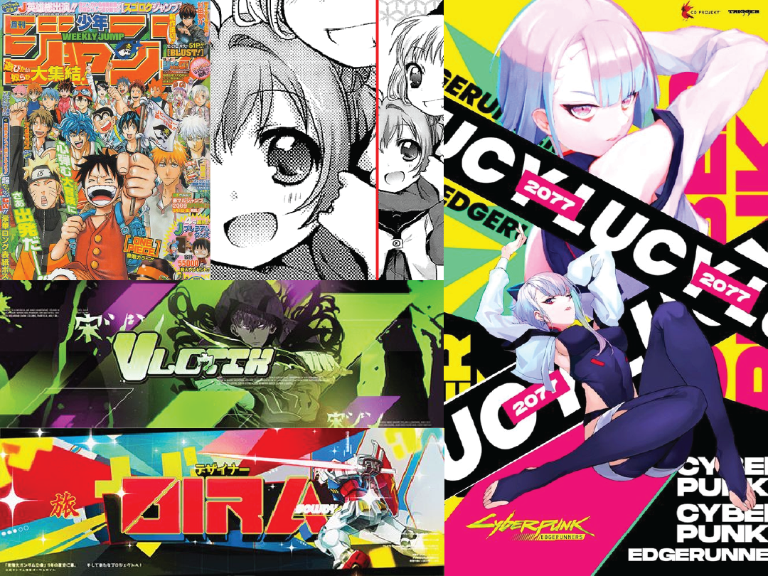
The visual pattern uses spikes, half-tone patterns, and parallelogram shapes to create a Shounen anime-inspired look appealing to the young demographics. Parallelograms function as the background for all materials helping unify the visual elements with the logo.