Logo Concept Development
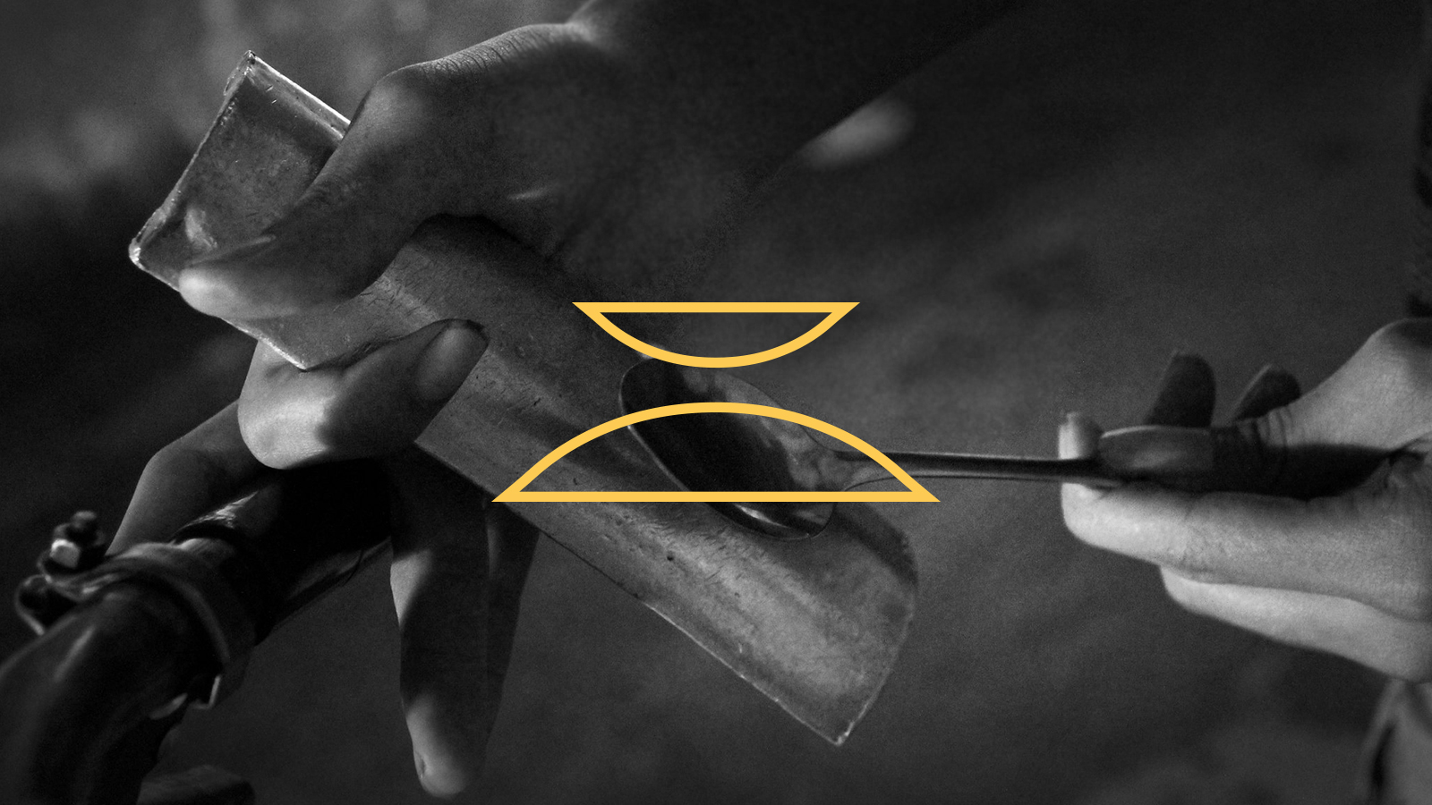
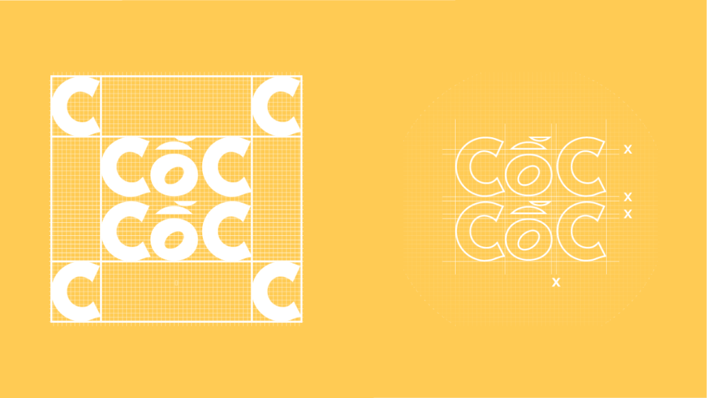
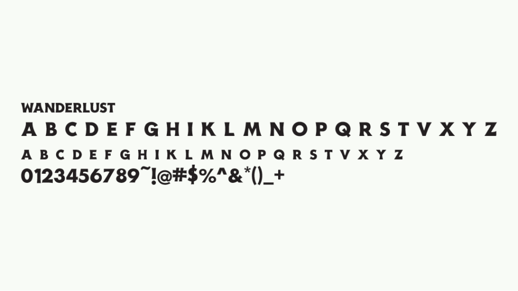
The wordmark uses Wanderlust, which resembles the hand-drawn letterings in billboards in the 1900s in Saigon and possesses a modern touch. The circumflex and high-rising tone marks are replaced by the shapes of two pieces of metal used to create the sound. The visual representation of the instrument accentuates the depiction of the sound “Cốc Cốc” from the name.
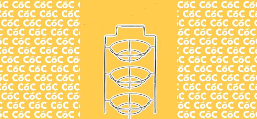
Visualisation
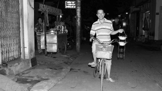
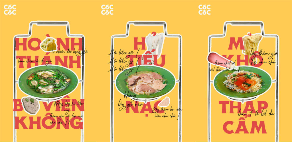
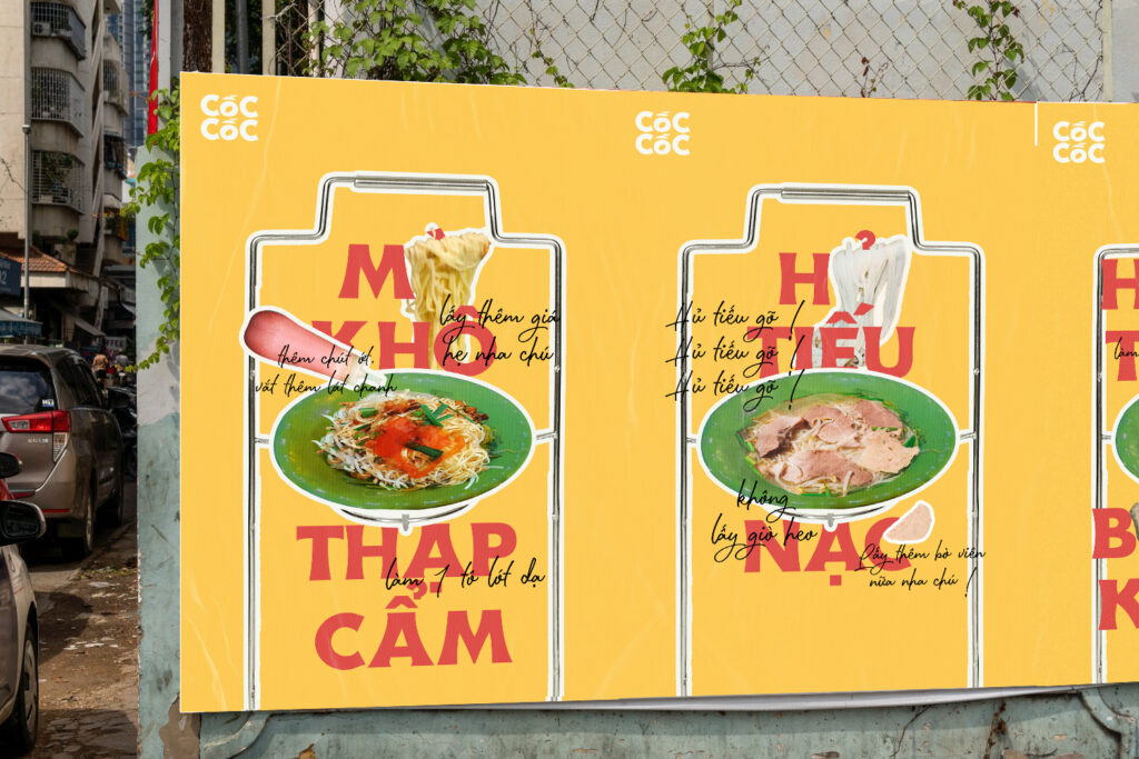
The identity uses a commonly-used dish holder with a handle for delivering the bowl of rice noodles as the key visual component.
Colour Palette
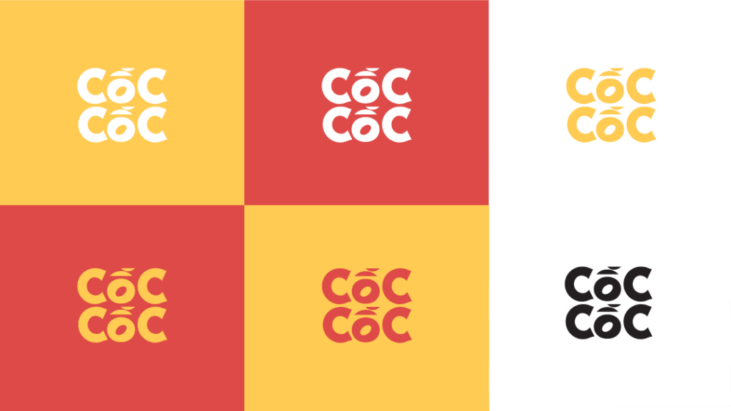
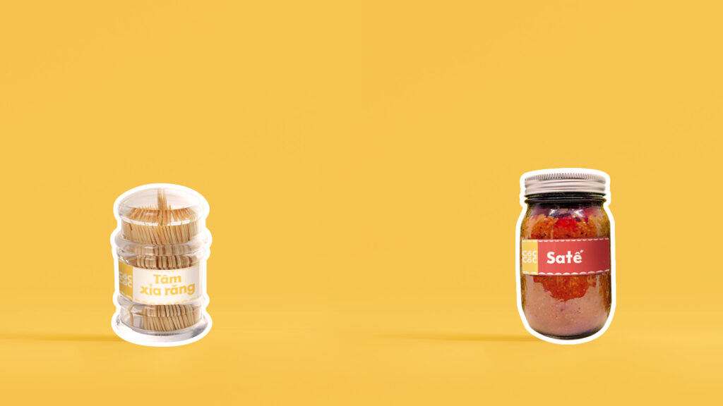
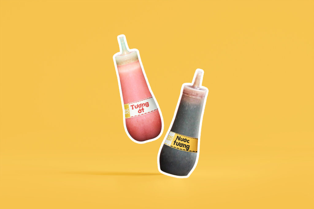
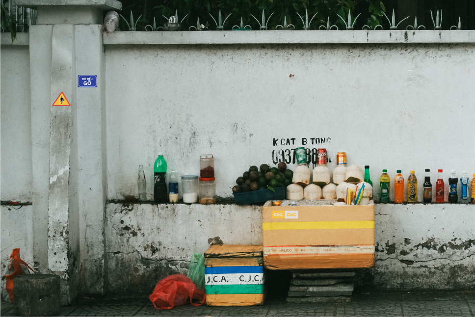
To capture the appetite for the food and the hustle and bustle of Saigon, the visual identity utilises vibrant yellow and red as the primary colours.
Typography
Wanderlust’s bold and expressive characteristics effectively communicate a strong and youthful voice in the posters and other materials of the identity.