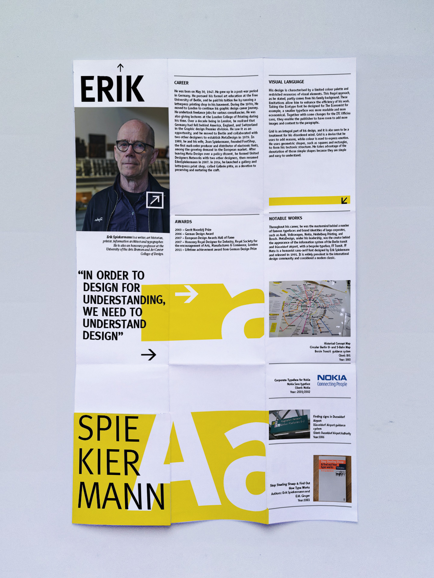
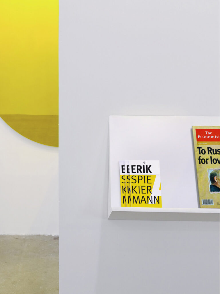
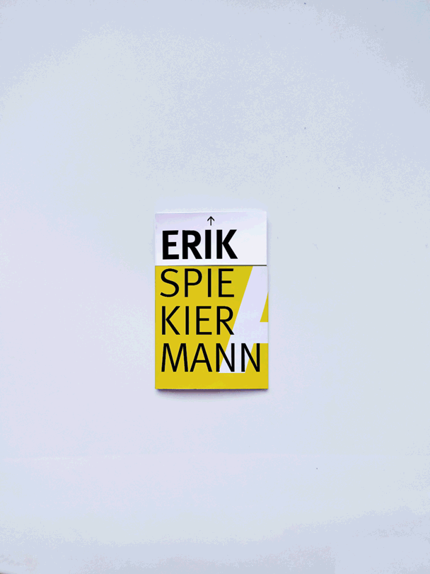
Brochure Concept
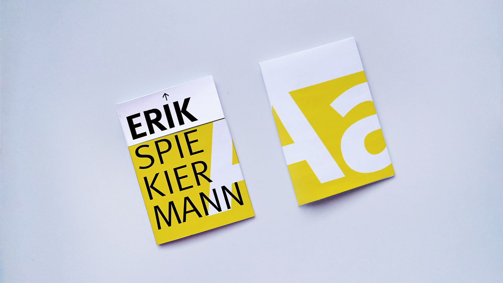
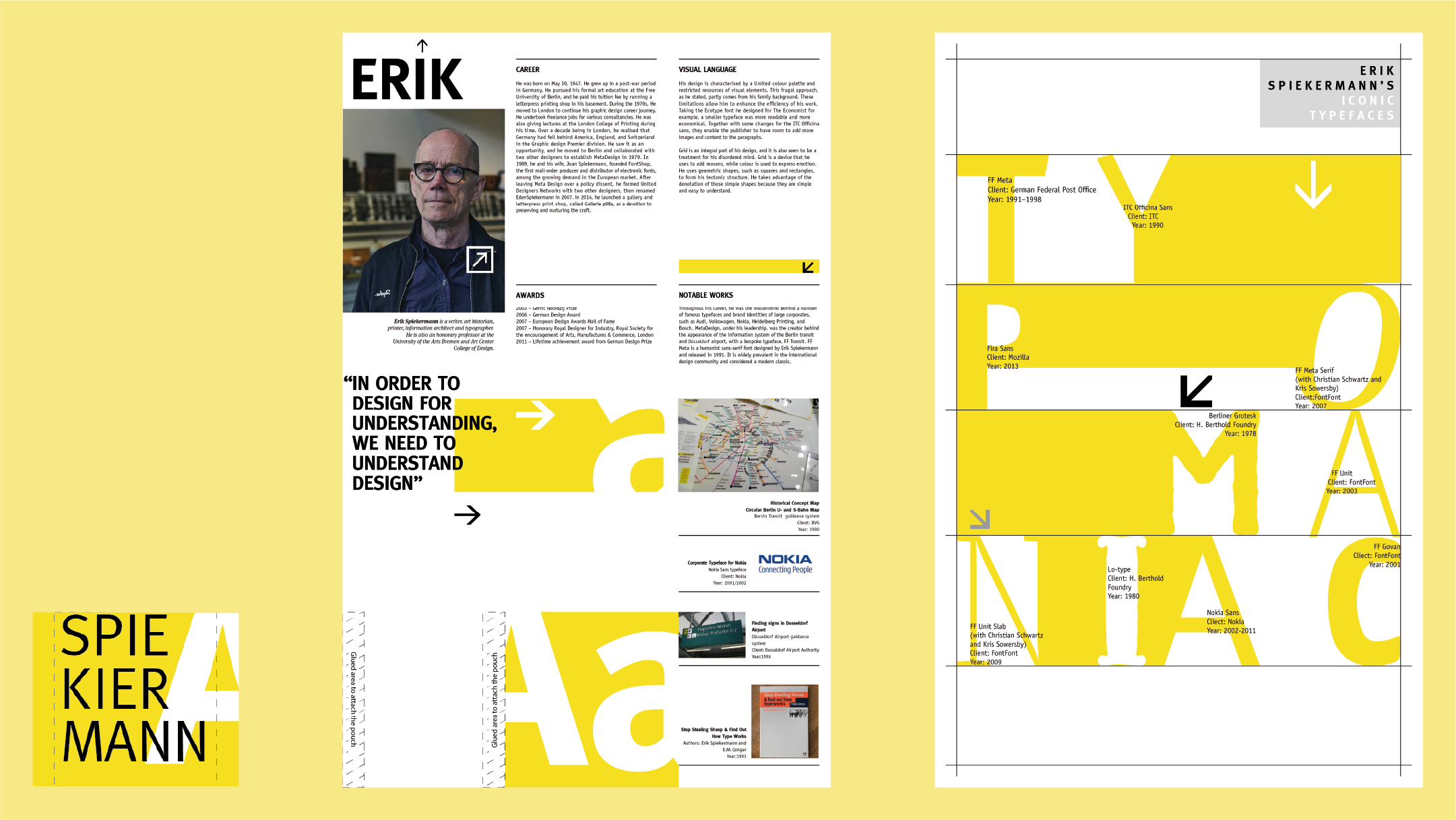
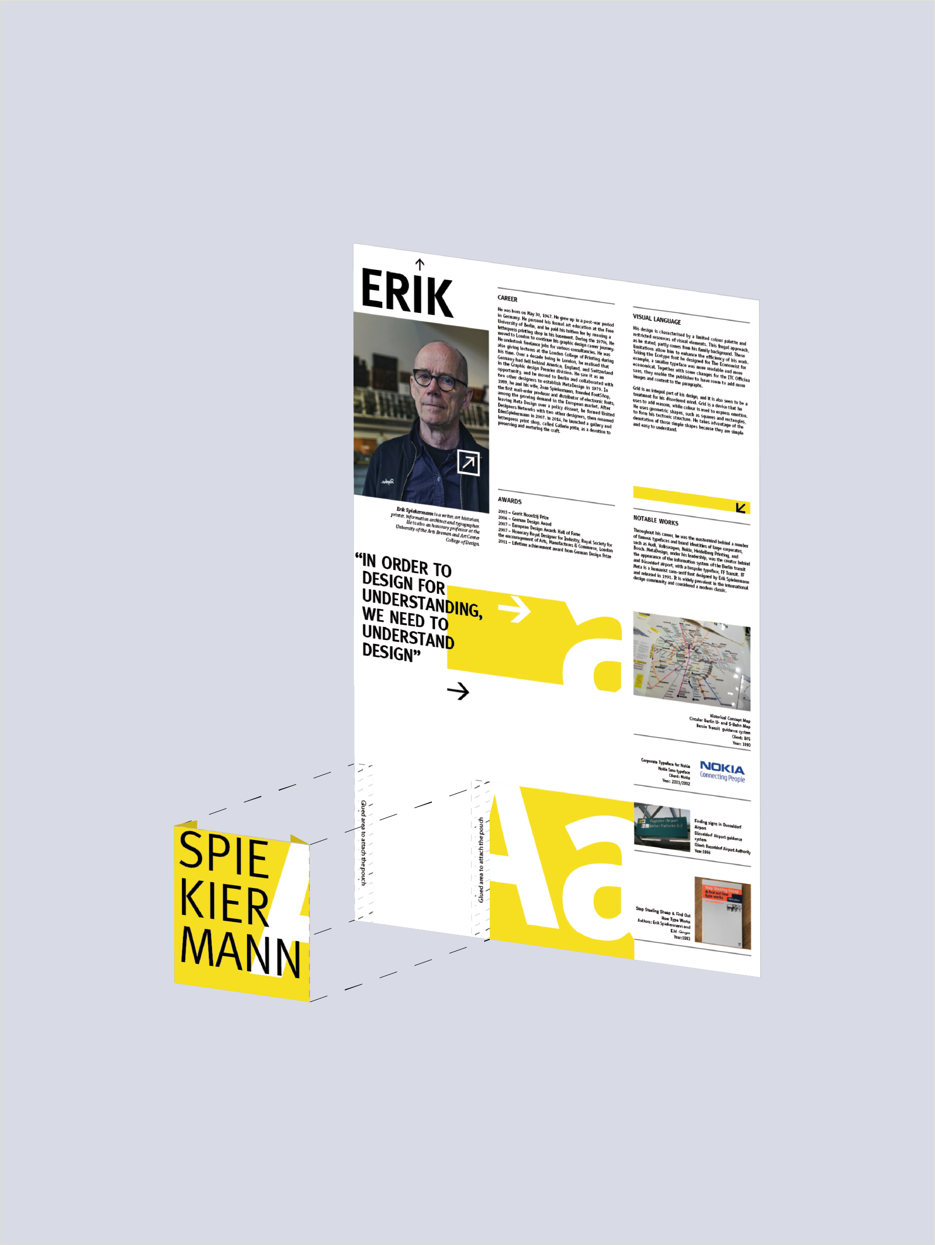
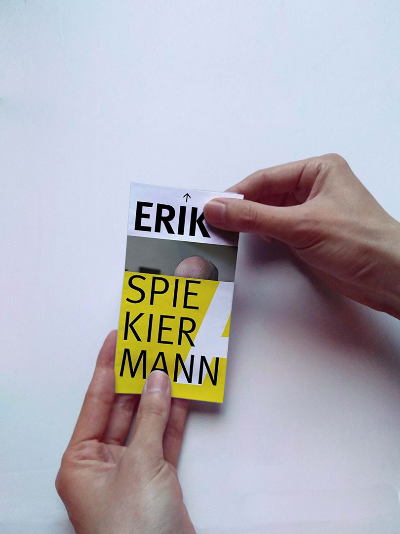
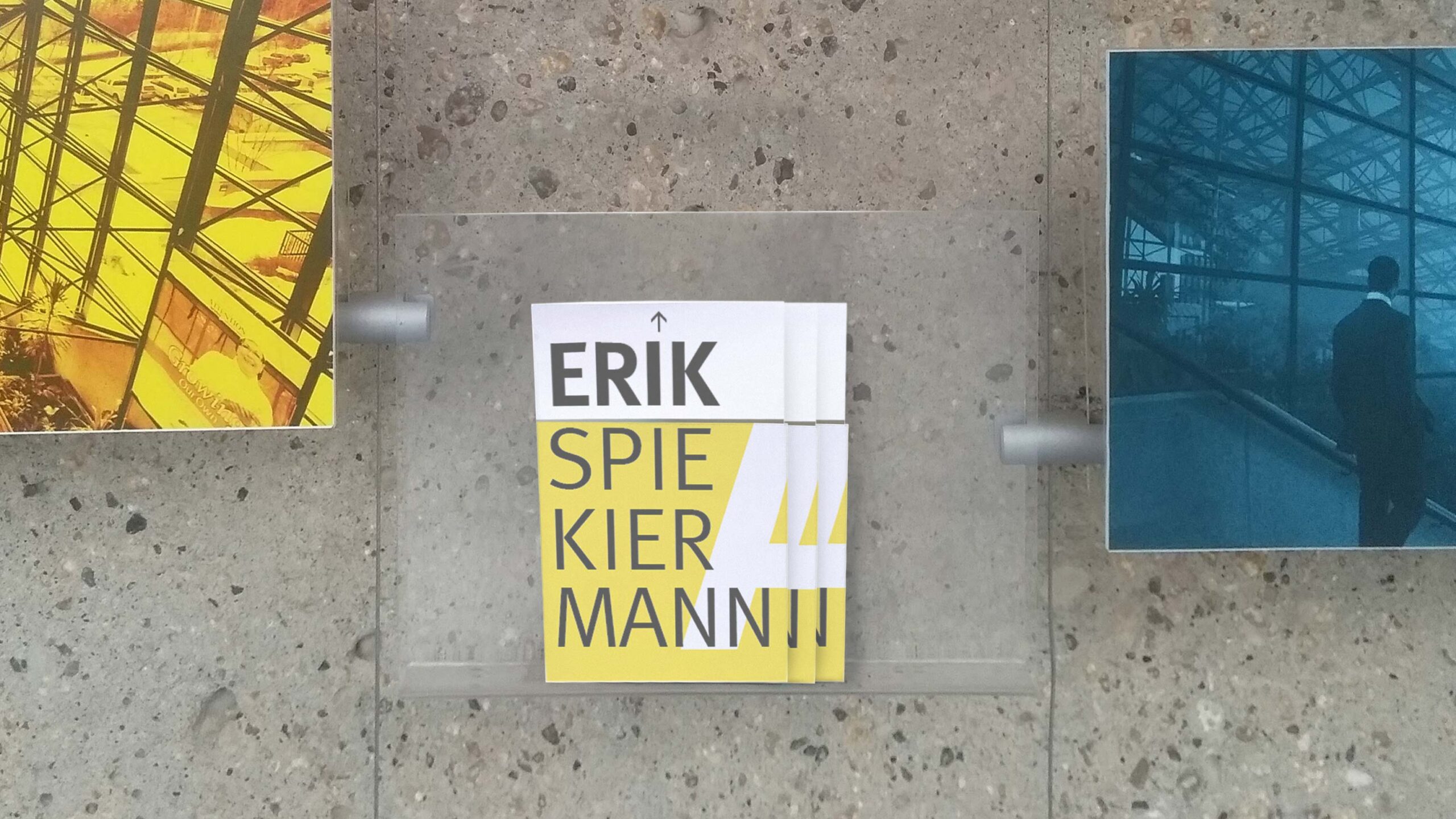
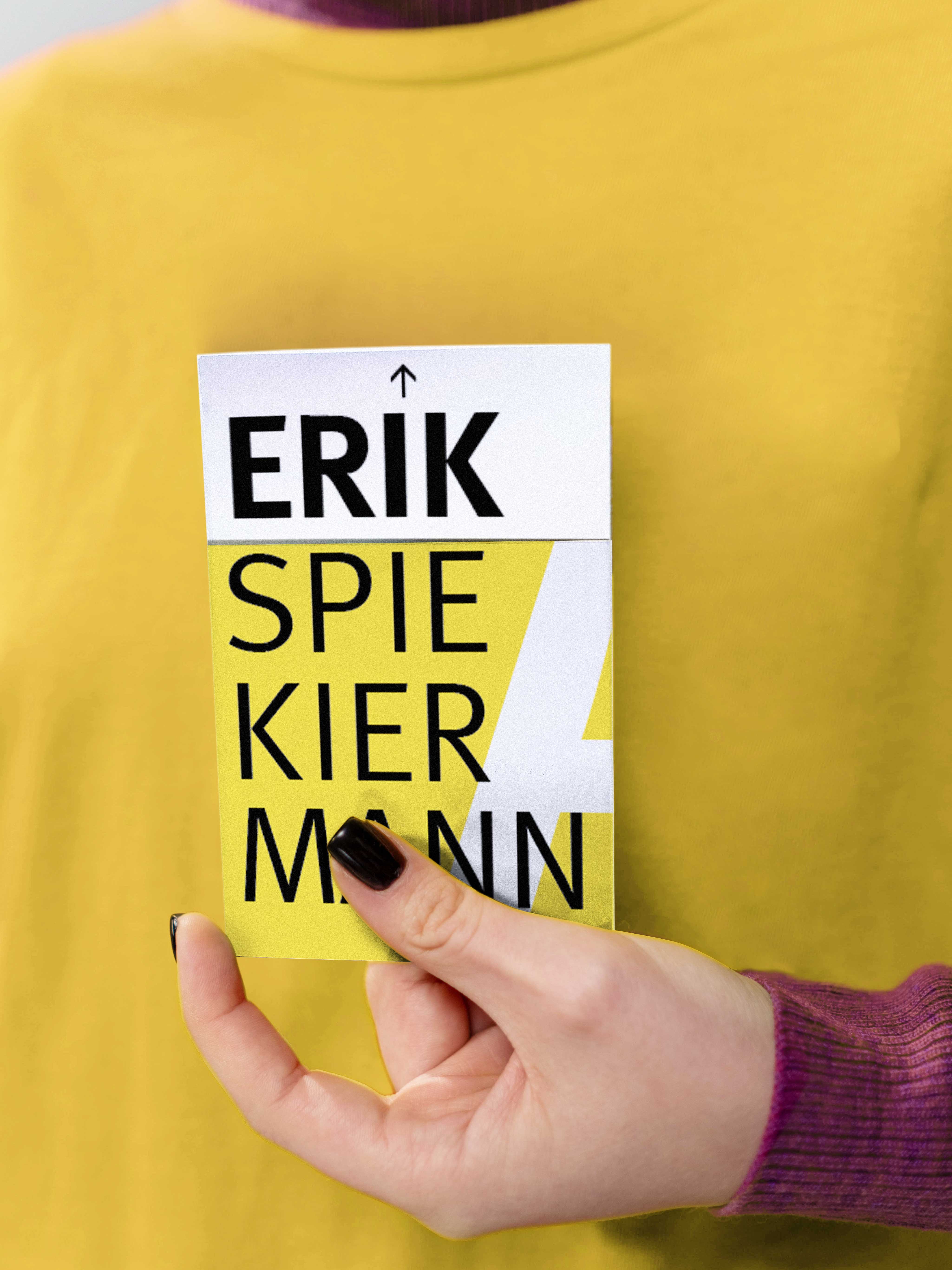
The brochure has a map fold style and a kangaroo pouch. As it is unfolded, information about the designer reveals, starting with his quote, then life, career, and awards and ending with his ideals and notable works in the last fold. When the brochure is folded, the last fold will slide into the kangaroo pouch, bringing his first and last name close together.
Visualisation
Taking his design for the Berlin transit system as an inspiration, the main visual elements encompass bold lines and arrows as signals. These devices lead the viewers’ eyes through each section of the brochure.
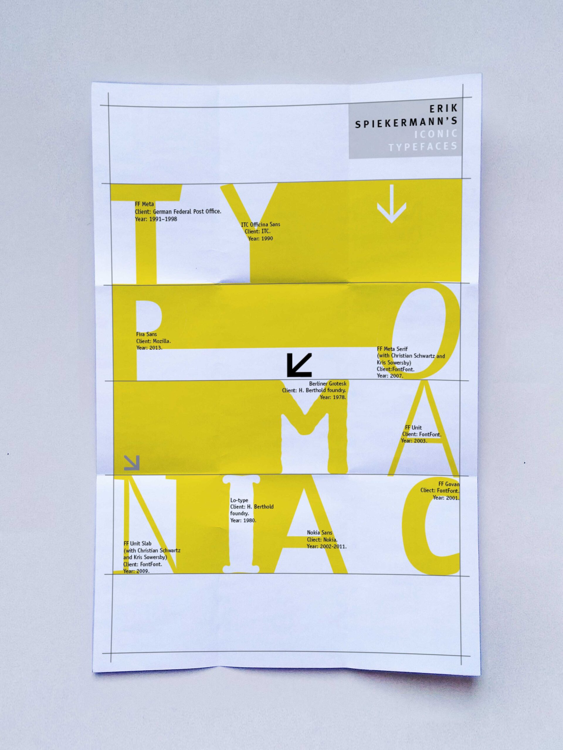
The back page uses his notable typefaces for each letter to form the word “typomaniac”. The letters are laid out on a grid, and those on the same row are linked using positive and negative spaces. The back page also repeats the arrows, lines, and rectangles on the front page to attain the cohesive look of the overall design.
Colour Palette
A colour palette, with primary yellow, red, black and white, was used for the entire biography to emulate the common colour choices in his works.
Typography
The name uses FF meta, of which the clean and solid look makes it ideal for reflecting the essence of his design principles. The body text uses his other highly legible, remarkably functional typeface, ITC Officina.