Solution
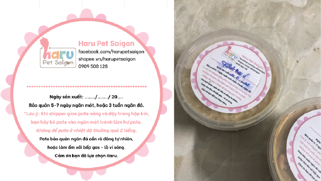
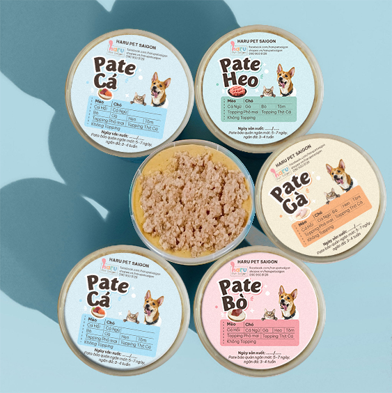
As making individual designs for every order impractical, the use of markers on the labels was maintained. The solution was to diversify and categorise the labels by the meat types and to add all topping options to the labels. It eliminates the need for legibility, as words are all printed. They now need to either tick or circle the right items on the new stickers, and moisture does not affect the ability to see the order. Furthermore, the label variety also opens opportunities to use graphics to express the lively and fun-loving personalities of the brand.
Colour Palette
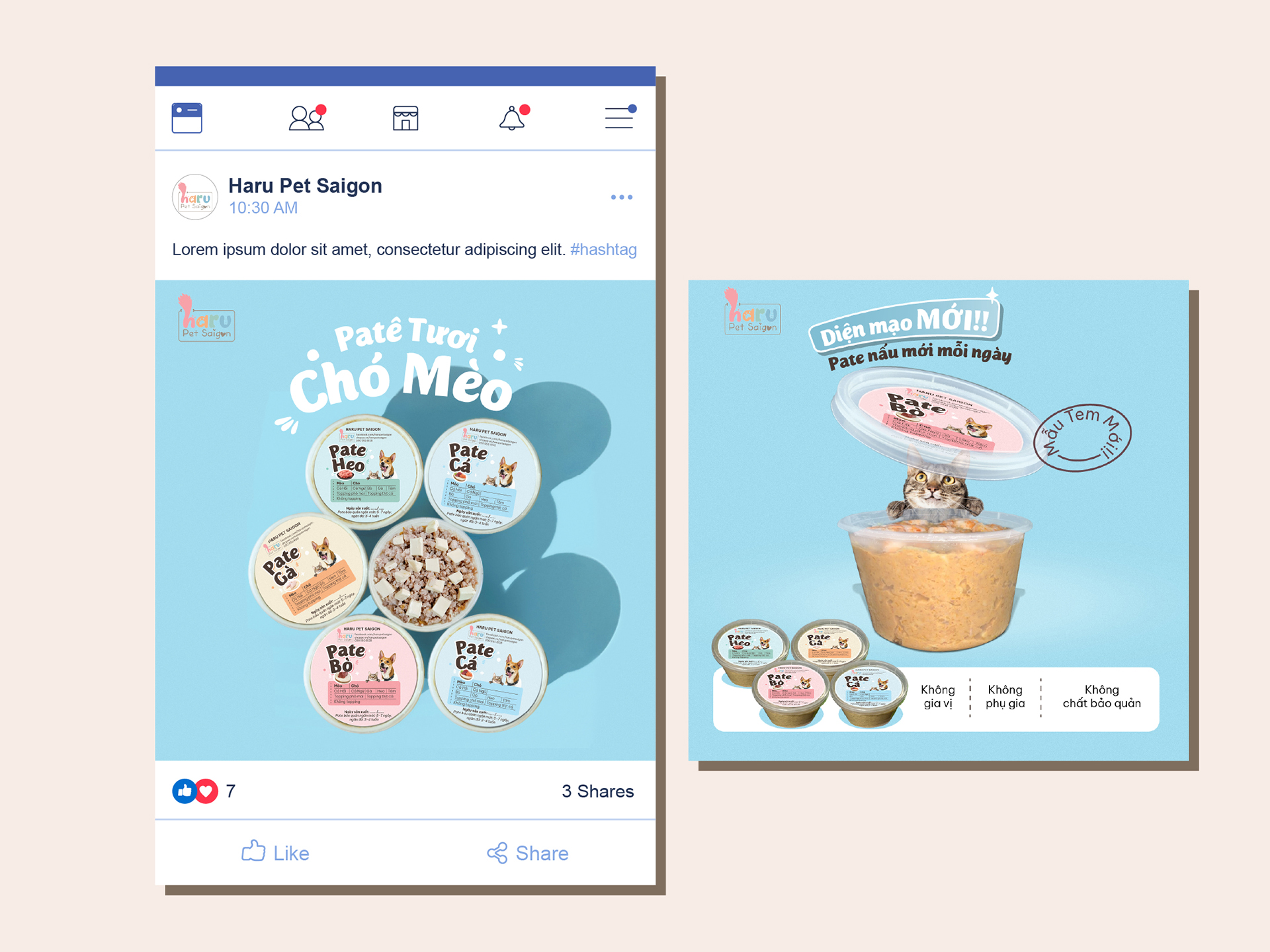
The chosen colour palette derives from the existing graphics of the shop on social media channels, helping keep a consistent look and feel.
Typography
The use of Mijas, a display sans serif font with cute and bubbly strokes, helps express the lively and witty personality of the brand.
Visualisation
The appearance of Haru, the owner’s dog, also strengthens brand awareness, as its photography has been used extensively on all of the shop’s social media sites.