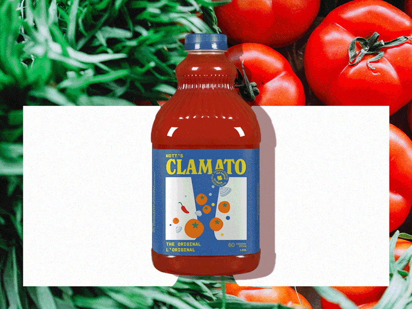
Logo Development
While the logo is simplified and flattened, the treatment by no means diminishes the vibrant and playful character of the predecessor but centres around authenticity and heritage. The new logo uses a condensed serif font, which took inspiration from the groovy style of the influential decade.
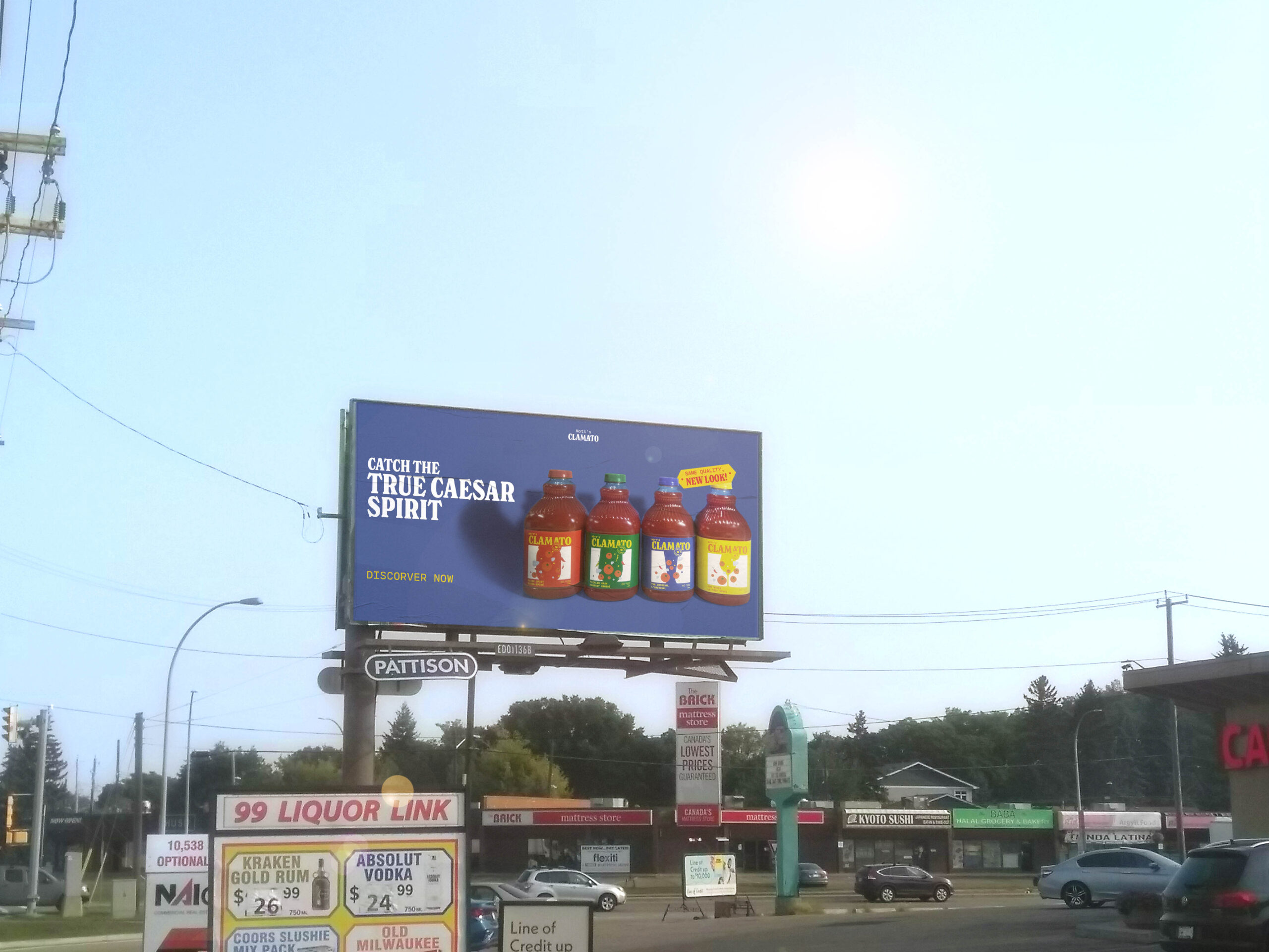
Visualisation
The overall design obtains a minimal style with simple shapes and structures that raged in the 70s, enabling it to communicate impactfully without being overdone and busy.
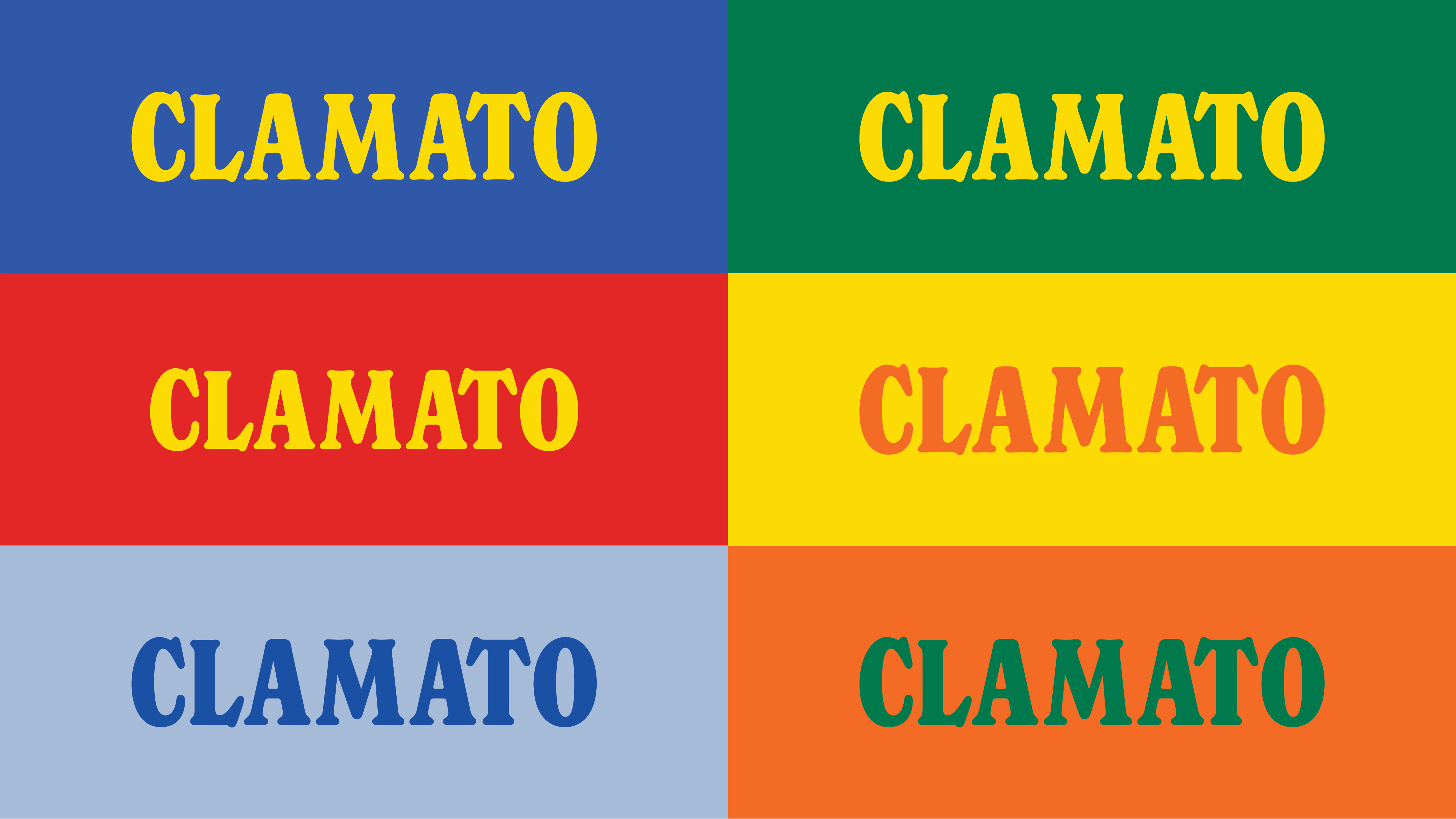
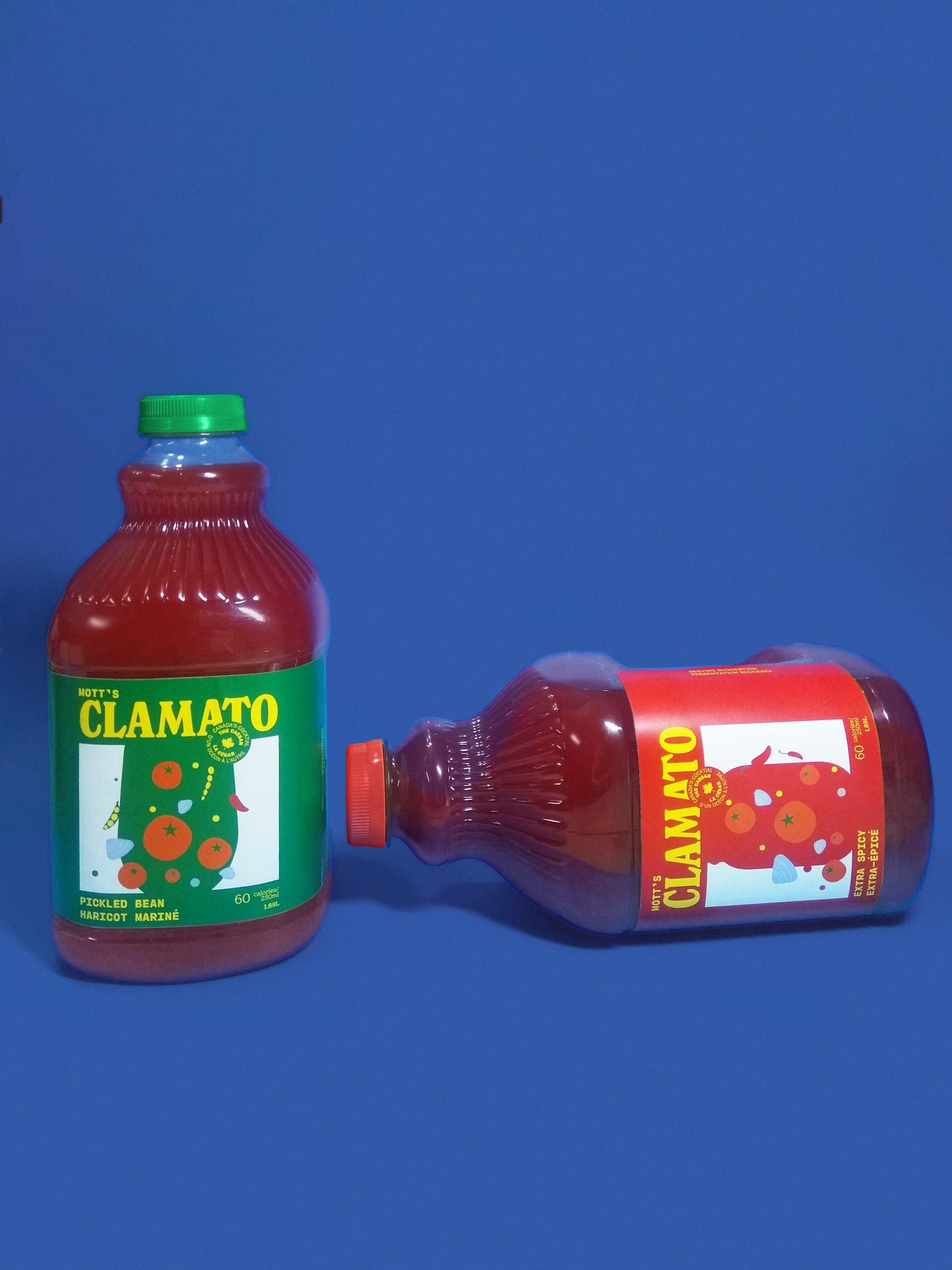
Colour Palette
The colour palette is drawn from the old labels and adapted to clashing tones that typify the 70s era. The vibrant colour palette helps the design stay up-to-date with the current design scene.
Typography
Paring with New Spirit, used in the logo and headings, is Cartography CF, a monospace typeface with rounded edges and hints at the typewriter era. The combination evokes a familiar, warm, and nature-friendly association with the design.
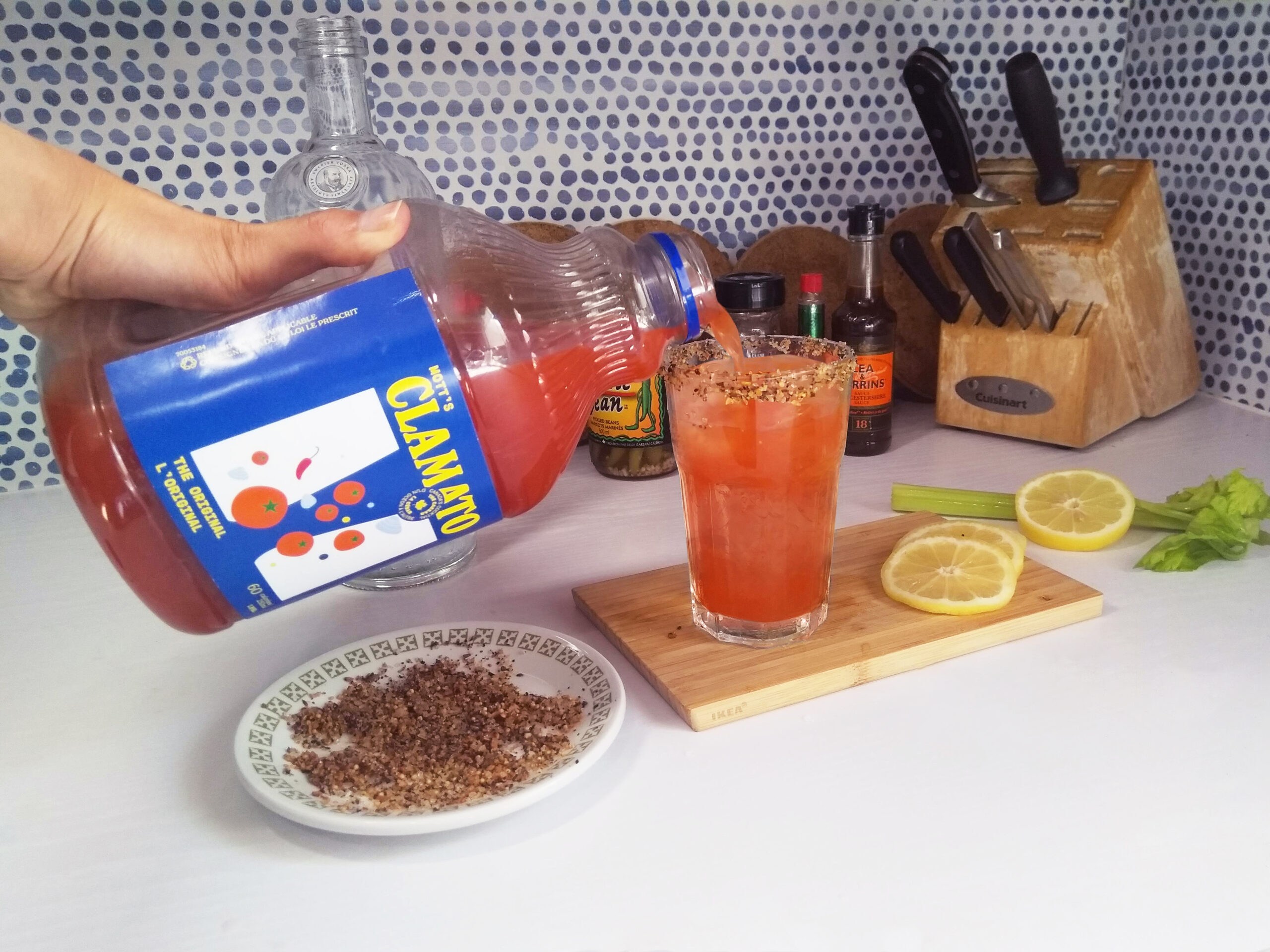
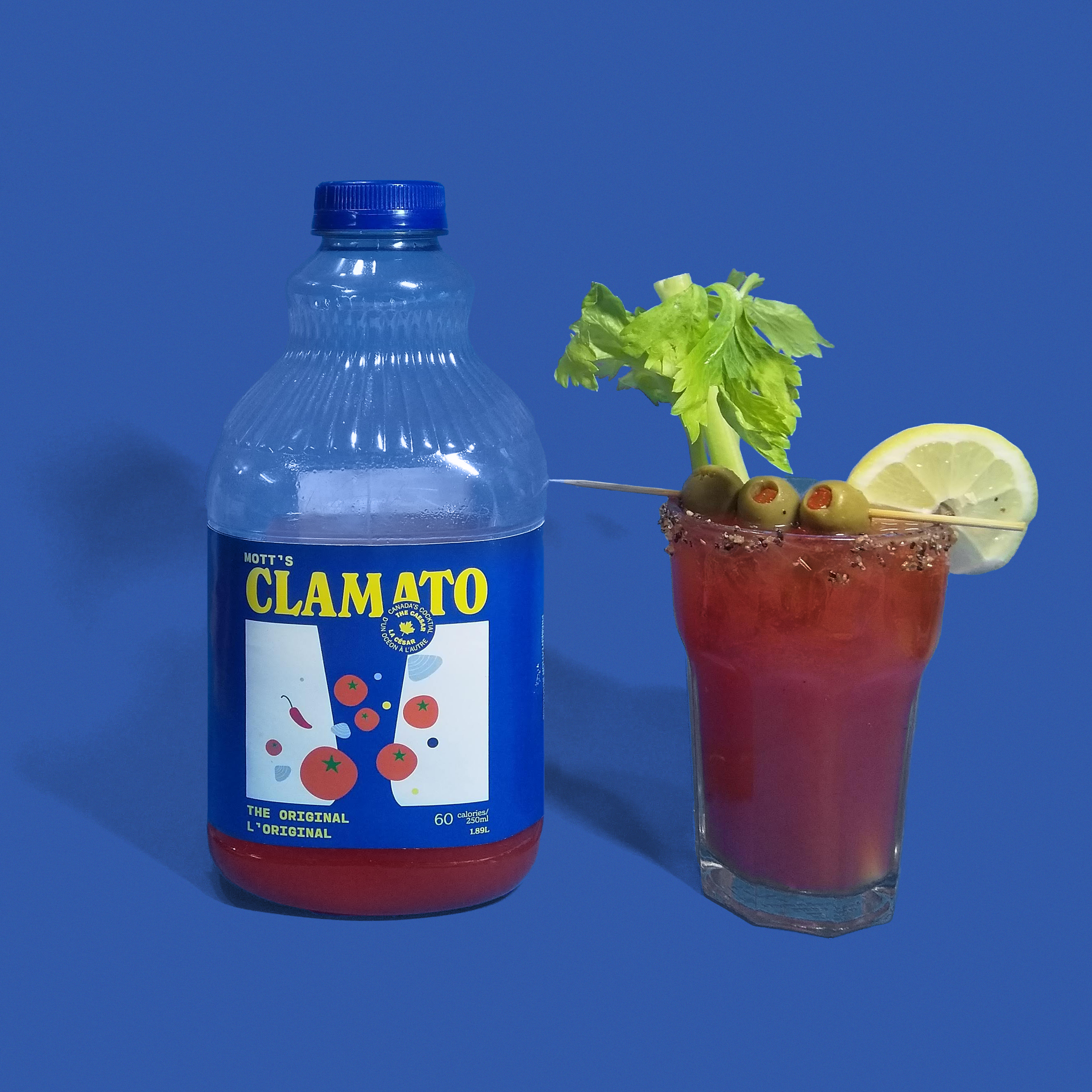
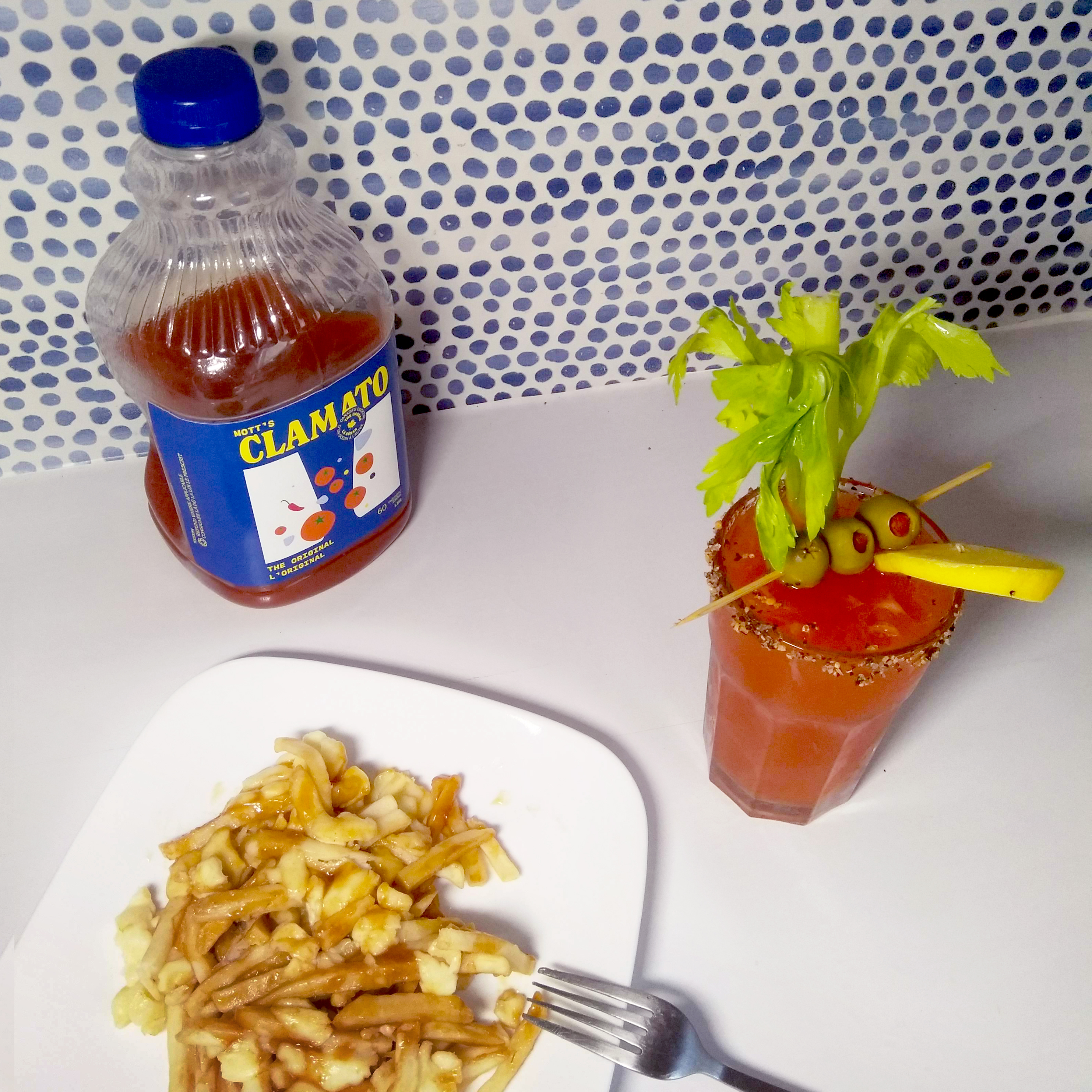
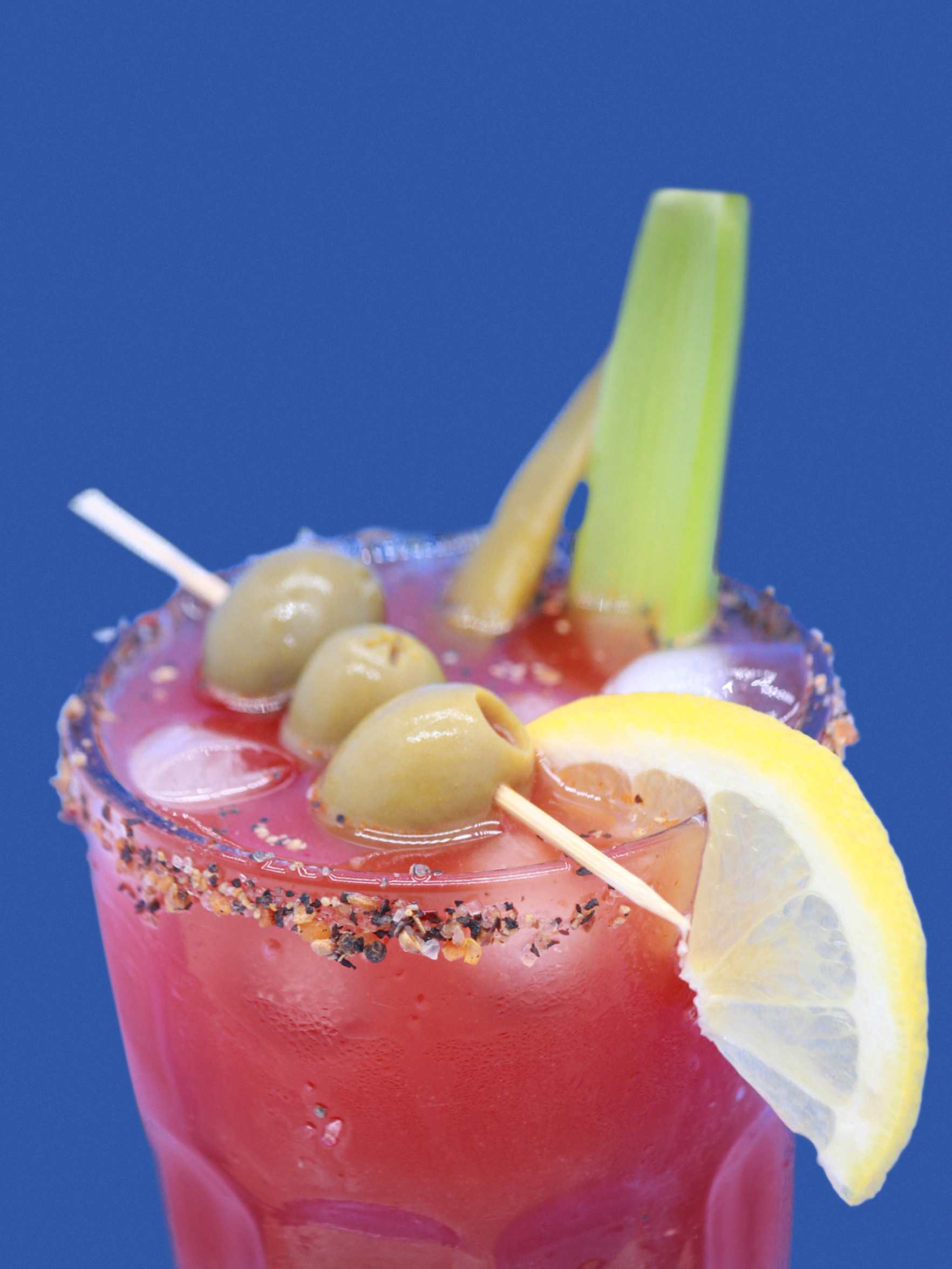
Photography
The photography style pursues a minimal approach, with products placed on a clean background. Understanding the preference of making one own Caesar at home, the kitchen setting is added to the photography series to effectively connect with the audience.